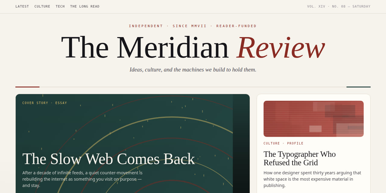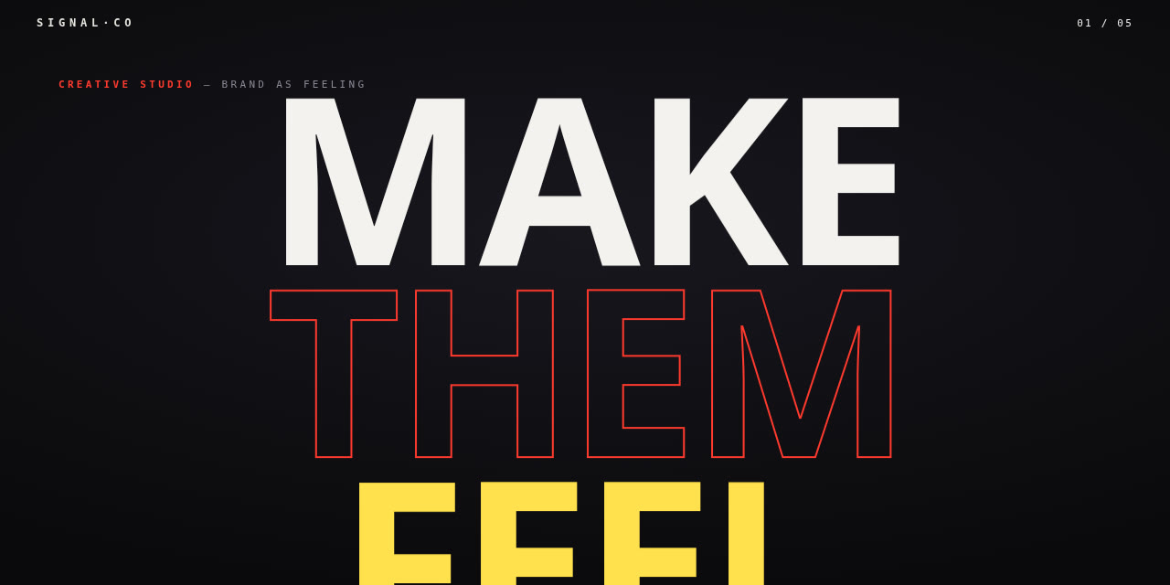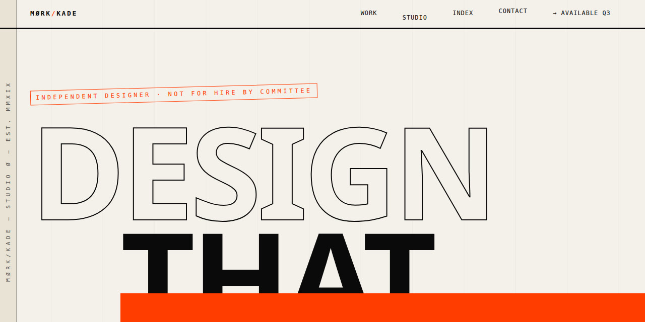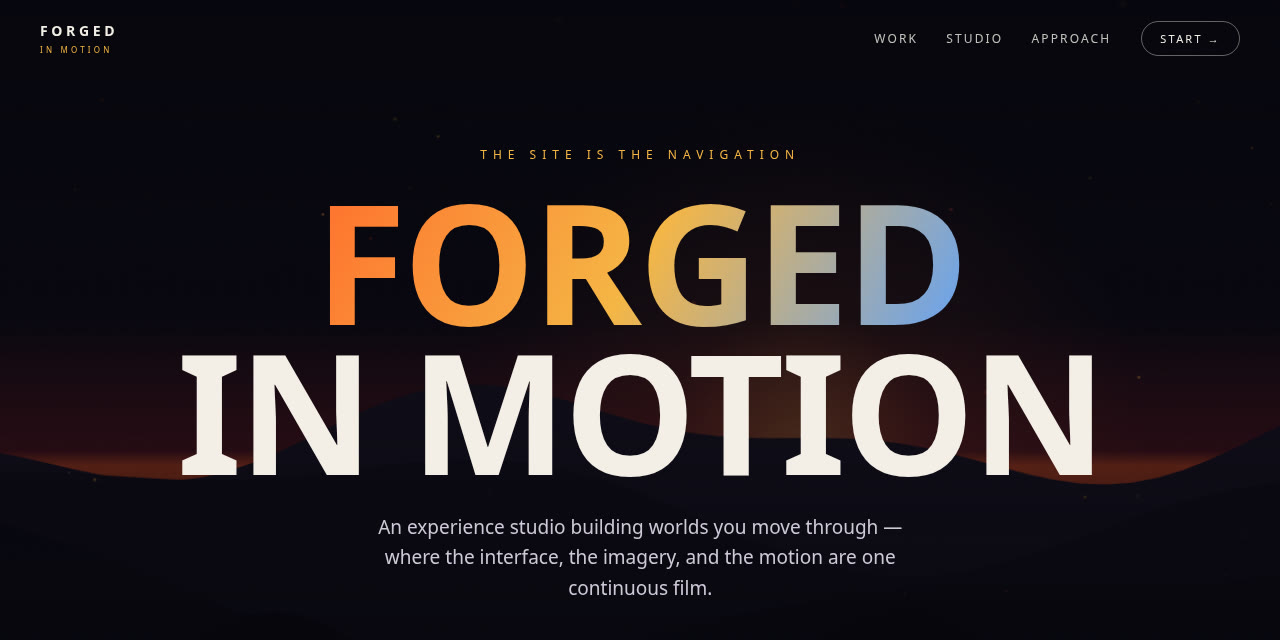

Not a gallery of pretty pages — a working library of design capabilities, sorted by what they're for. Browse a card, open its live demo, and see which vocabulary fits which kind of site.

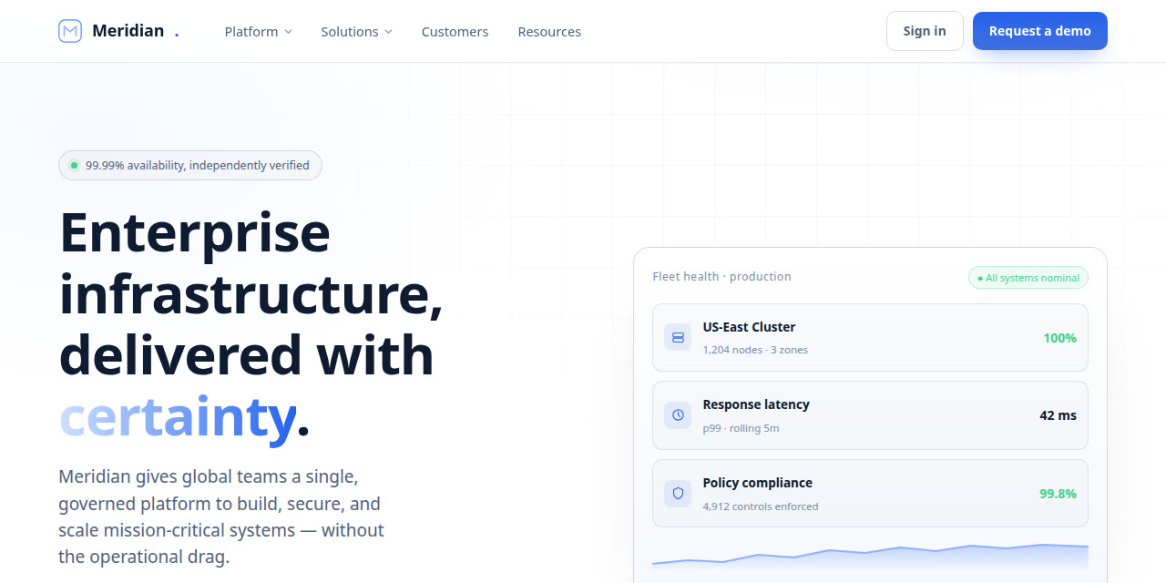
Header + hero + three-column value + logo wall + fat footer, done well. The convention that signals legitimacy and scale.

Sticky CTA, product-shot hero, bento feature grid, three-tier pricing anchored on the middle. Built to turn cold → trial.

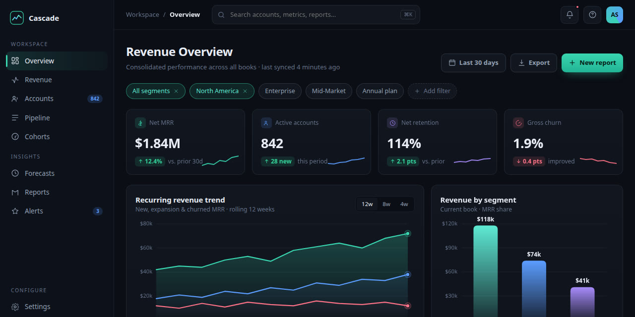
Left-rail nav, KPI tiles, tables, filters — near-zero motion. For committed users reading state and acting fast.

Asymmetric tiles of varying weight with active hover reveals. Show many things at different importance in one scannable frame.

Oversized variable-font hero where letters morph, reveal, and recombine on scroll and cursor. Type as the whole experience.

Intentional overlap, misalignment, monospace, type-as-hero. The counter-trend that reads "art-directed, not templated."

A real cinematic film plays as you scroll — live buttons and content composed inside it, chrome baked in so it never feels corporate.

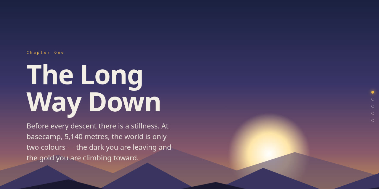
Multi-layer depth narrative with compositor-threaded parallax and scroll-snapped scenes. Slow, deliberate, aspirational.

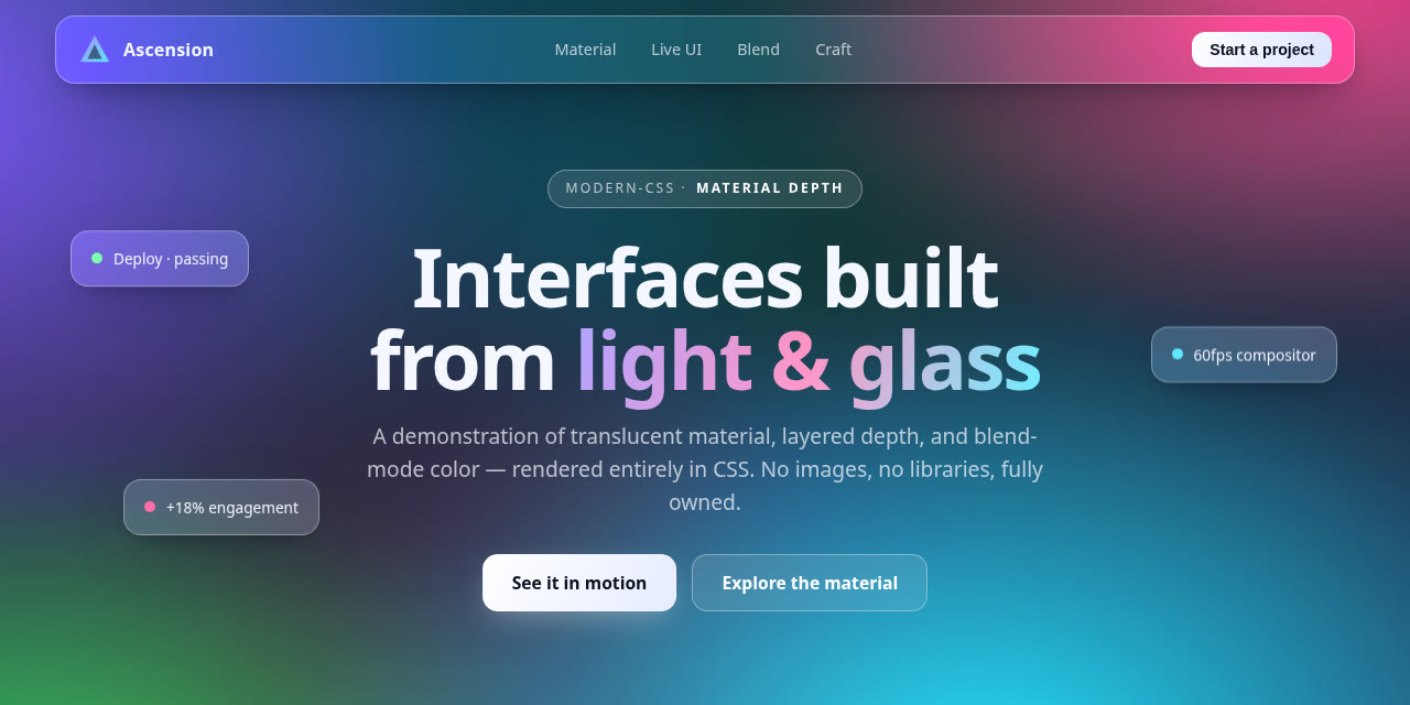
A sampler: frosted glass over motion, duotone blends, mask wipes, cursor-invert, 3D-tilt cards. The modern-CSS toolbox.

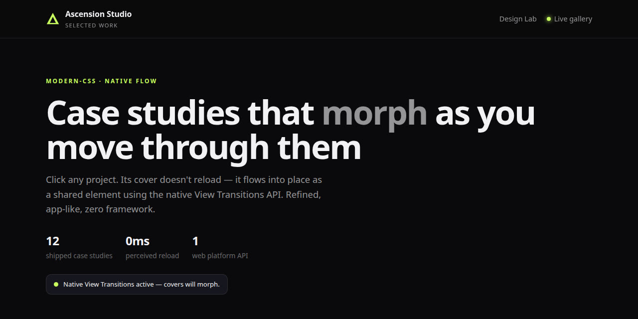
A multi-page mini-flow where navigation feels app-native — shared elements morph between pages. Pure static, no framework.

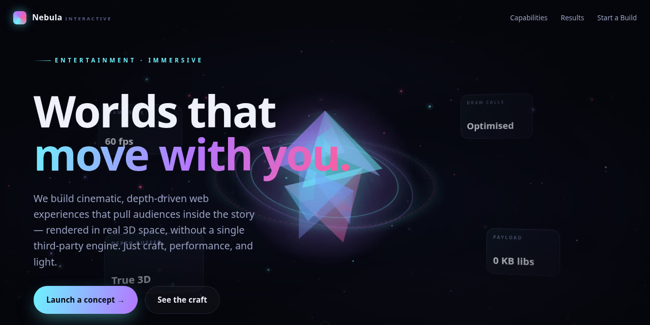
One WebGL showpiece — a physics-weighted hero object or mouse-reveal scene. The top tier, with a static fallback for weak devices.